When Beauty Meets Function: My Journey with the Skylight Calendar
For someone who has spent countless hours curating the perfect aesthetic for our home, bringing in new technology always comes with a moment of hesitation. Will it disrupt the clean lines and minimalist vibe I’ve worked so hard to create? That was my initial concern when considering the Skylight Calendar. As a self-proclaimed design enthusiast who believes our surroundings deeply impact our mood and productivity, I wasn’t willing to compromise on aesthetics—even for the sake of better organization.
Let me be transparent from the start: this article contains affiliate marketing links. If you purchase products through these links, I may receive a small commission at no additional cost to you.
Our family calendar situation had become something of a running joke among friends. A paper calendar with coffee stains, sticky notes scattered across the refrigerator, and three different digital calendars that never seemed to sync properly. The visual chaos was starting to affect my peace of mind, and more importantly, we were missing appointments and double-booking weekends.
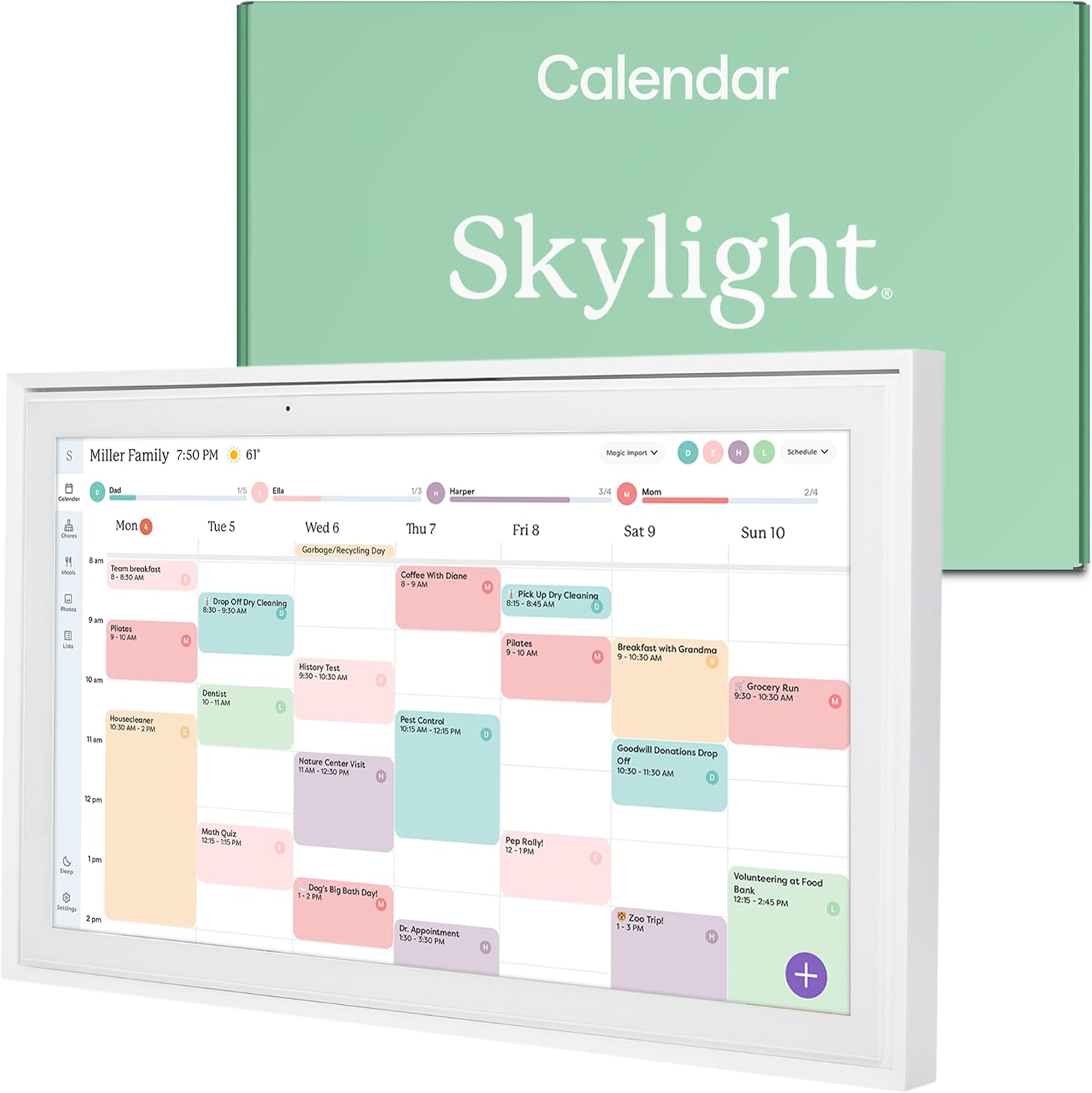
When I first unboxed the Skylight Calendar, I was immediately struck by its sleek design. The 15-inch touchscreen with its slim profile and clean white frame felt like something that belonged in our home rather than an intrusive piece of technology. According to Architectural Digest, thoughtfully integrated technology can actually enhance a space’s design rather than detract from it—and I was about to put that theory to the test.
First Impressions: The Aesthetic Appeal
Before diving into functionality, let’s talk design. The Skylight Calendar’s 15-inch display strikes a perfect balance—large enough to be useful but not so imposing that it dominates a wall. Its clean lines and minimal bezel allow it to blend seamlessly with both modern and traditional decor styles.
I chose to mount mine in our kitchen—the heart of our home—using the included wall mount. The process was straightforward, requiring just basic tools and about 15 minutes. The result is a display that looks intentional rather than afterthought, almost like a piece of interactive art on our wall.
For those who prefer flexibility, the calendar can also stand on a countertop. I experimented with this placement initially, moving it between our kitchen island and home office desk before deciding on its permanent wall location.
What truly impressed me was how the display’s colors and brightness adapt to the ambient lighting in our home. During bright daylight, it’s crisp and clear without being harsh, while in the evening, it automatically dims to a more soothing glow that doesn’t disrupt our carefully curated lighting scheme.
Setting Up: Merging Technology with Daily Life
I’ve abandoned many promising organizational tools because the setup process was too cumbersome. The Skylight Calendar, however, surprised me with its intuitive onboarding process. After plugging it in and connecting to our Wi-Fi, I was able to sync our existing Google and iCloud calendars within minutes.
The real test came when incorporating my husband’s Outlook work calendar and our children’s activity schedules. The Skylight handled these multiple feeds seamlessly, color-coding each family member’s events for visual clarity. According to Psychology Today, color-coding can significantly improve information processing and retention—something I’ve found to be true as we’ve adjusted to our new system.
I particularly appreciated the thoughtful design of the interface. The typography is clean and legible from across the room, and the color palette is sophisticated rather than childish—a refreshing change from many family-oriented tech products that seem to assume we all want primary colors in our homes.
The chart above illustrates one of the most significant changes in our household. Before implementing the Skylight Calendar, I was spending over three hours each week managing our family’s schedules—updating paper calendars, sending reminder texts, and reconciling conflicting appointments. With our new system in place, that time has dropped to less than an hour per week, primarily spent on initial event entry. The calendar handles the synchronization and reminders automatically.
This time savings has been invaluable, allowing me to focus on more meaningful family interactions rather than administrative tasks. It’s also eliminated the frustration of missed appointments and double-bookings, which were occurring at least twice a month before our new system.
Living With It: Daily Interactions and Visual Harmony
After using the Skylight Calendar for three months, I can confidently say it has become an essential part of our home. What I appreciate most is how it enhances rather than disrupts our space. The display’s customization options allow it to complement our home’s color scheme, and the screensaver feature (available with the Plus Plan) displays tasteful photographs when the calendar isn’t in active use.
The touchscreen functionality is responsive and intuitive—my 7-year-old quickly figured out how to check her weekly schedule and mark her chores as complete. The interface strikes a perfect balance between simplicity and functionality, avoiding the cluttered feel of many digital interfaces.
I’ve found myself appreciating different features at different times of day:
- Morning routine: The daily view gives us a quick family briefing over breakfast
- Afternoon planning: The weekly meal plan display helps me prepare for dinner without last-minute scrambling
- Evening wind-down: The dimmed display serves as a gentle reminder of tomorrow’s commitments
The chore chart functionality deserves special mention for its elegant implementation. Rather than the garish sticker charts we’ve tried in the past, Skylight offers a sophisticated approach to task management that feels appropriate for both children and adults. Tasks can be assigned, completed, and verified all through the touchscreen or mobile app.
The Three Features That Won Me Over
After using the Skylight Calendar daily, three features stand out as particularly valuable for someone who cares about both aesthetics and functionality:
First, the customizable display options allow me to adjust colors, fonts, and layouts to complement our home’s design aesthetic. I’ve set ours to a monochromatic color scheme that coordinates with our kitchen’s neutral palette, with subtle color accents to differentiate family members’ events. This attention to visual detail makes the calendar feel like a deliberate design choice rather than a technological necessity.
Second, the meal planning feature has transformed our weeknight dinner routine. I can display the week’s menu directly on the calendar, complete with links to recipes if needed. This eliminates the daily “what’s for dinner” question and helps me prepare ingredients in advance. The visual presentation is clean and appetizing, with optional food photography that actually looks sophisticated rather than like stock images.
Third, the seamless synchronization between the wall display and mobile app means I can update our family schedule from anywhere. While shopping, I can add a spontaneous dinner plan; while at work, I can check if my husband has scheduled the children’s dentist appointments. This connectivity feels magical without being intrusive, and the interface remains consistent between devices.
Comparing to Alternatives: The Design-Conscious Choice
Before committing to the Skylight Calendar, I researched several alternatives. Traditional paper planners offered aesthetic appeal but lacked synchronization capabilities. Smart displays from major tech companies provided functionality but often looked distinctly tech-centric—all black plastic and blinking lights.
The chart above visualizes how different calendar solutions compare in terms of functionality versus aesthetic appeal. Traditional paper calendars score high on aesthetics but low on functionality. Smart speakers offer good functionality but minimal visual appeal. Generic tablets fall somewhere in the middle on both scales. The Skylight Calendar distinguishes itself by excelling in both categories, offering robust features without compromising on design sensibility.
This balance is particularly important in open-concept homes like ours, where technology is visible from multiple living spaces. The Skylight Calendar looks intentional rather than intrusive, complementing our interior design rather than competing with it.
The Investment Consideration
At $279.99, the Skylight Calendar represents a significant investment compared to traditional paper planners or basic digital calendars. However, when I consider the time saved from missed appointments, last-minute meal planning, and family miscommunications, the value becomes clearer.
The Basic Plan includes all essential functionality, while the Plus Plan ($39.99 annually) adds features like custom photo screensavers, Magic Import for scanning paper documents into your calendar, and advanced planning tools. I opted for the Plus Plan primarily for the aesthetic customization options, which allow me to better integrate the calendar into our home’s design scheme.
One consideration for design-conscious consumers: the white frame is currently the only option. While it works beautifully in most interiors, those with very specific color schemes might wish for additional finish options. I’ve addressed this by mounting ours within a custom frame that complements our kitchen cabinetry—a simple DIY project that took about an hour.
Small Aesthetic Improvements I’d Love to See
While the Skylight Calendar has beautifully addressed the intersection of technology and design, there are a few refinements I’d love to see in future iterations:
- Frame color options beyond white to better integrate with various interior design styles
- More sophisticated font choices for those who appreciate typography
- Additional screensaver options that function as digital art when the calendar isn’t in active use
- A slightly thinner profile that sits even more flush against the wall
These are minor considerations in an otherwise exceptional product, but they reflect the level of design thinking that could elevate the Skylight Calendar from excellent to perfect for design enthusiasts.
The Unexpected Benefits
Beyond the obvious organizational improvements, the Skylight Calendar has brought some unexpected benefits to our home. The shared visibility of our schedule has fostered more family conversations about how we spend our time. My children now better understand the rhythm of our week and have started taking more ownership of their commitments.
The meal planning feature has not only streamlined our grocery shopping but has also reduced food waste significantly. According to Natural Resources Defense Council, the average family wastes about 25% of the food they purchase—a statistic we’ve definitely improved upon since implementing our visible meal plan.
Perhaps most surprisingly, the calendar has become a conversation piece when friends visit. Its sleek design and functionality inevitably draw comments, and I’ve found myself enthusiastically demonstrating features I initially purchased for purely practical reasons.
Integration with Home Design Philosophy
For those who approach their home as a holistic design project, technology integration can be challenging. The Skylight Calendar represents a thoughtful approach to this challenge, acknowledging that family organization tools don’t need to be utilitarian eyesores.
I’ve positioned our calendar within a gallery wall arrangement, where it functions both as an organizational tool and as part of our home’s visual story. The clean lines and customizable display allow it to complement rather than compete with the photographs and artwork surrounding it.
This integration reflects a broader trend in home design toward technology that enhances rather than disrupts our living environments. As our homes become increasingly connected, products like the Skylight Calendar demonstrate how functionality and aesthetics can coexist beautifully.
Final Thoughts: When Form and Function Align
After three months with the Skylight Calendar, I can confidently say it has transformed our family’s organization while enhancing our home’s aesthetic. The thoughtful design, intuitive interface, and customizable display have made it a centerpiece of our daily routine—one that I’m proud to have visible in our carefully curated space.
For design-conscious consumers who value both form and function, the Skylight Calendar represents a rare find in the world of family organization tools. It acknowledges that the objects we bring into our homes should contribute positively to both our visual environment and our daily functionality.
The initial investment has been repaid many times over in reduced stress, better time management, and the simple pleasure of having a beautiful solution to a common family challenge. In a world where technology often demands aesthetic compromises, the Skylight Calendar stands out as a product that understands the importance of design in our everyday lives.
As we move into 2025, I’m looking forward to another year of beautifully organized family life, all managed through a device that feels like it was designed specifically for people who care deeply about their home environment. Smart home organization doesn’t have to come at the expense of your carefully curated aesthetic—the Skylight Calendar proves that beautifully.


